We’re all guilty of doing it – snoozing alarms, leaving our lunch on the counter, and even forgetting to take our vitamins. Establishing a routine is as difficult as it is important, especially when it requires you to repeat an action every day.
There’s no denying the range of benefits one can derive by adding a health supplement to their daily nutrition and movement. Yet, supplements are only helpful if we remember to take them.
During our initial consumer research, it was clear that most people who buy supplements either don’t consume them as often as they should, or never end up taking them altogether.
This is why when it came down to the packaging, we incorporated Scandinavian aesthetics and designed our supplements to be seen and used every day.
How Is Scandinavian Design Characterised?

“I would describe the Scandinavian design as minimalistic, very focused on clean lines, functionality and readability. It’s not cluttered at all, but very timeless and classic. “ Everything has a place and there’s a place for everything – there are no unnecessary trinkets or additions that don’t add value or function.
“I would say the colour palette is a mixture of neutral colours like tans and browns in addition to black and white and some accent colours that are used carefully.” Why does this incline towards neutrals? Well, Scandinavians really value nature and spending time outdoors, so there is a huge reliance on wooden elements and colours like tan and brown which complement other nature-inspired accent colours like sage green beautifully.
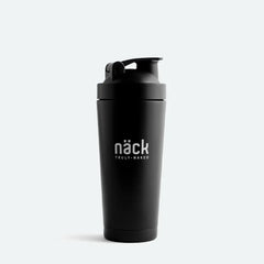
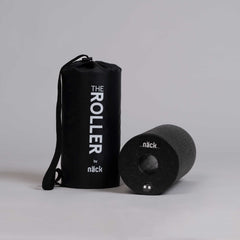
Näck’s Visual Identity And Scandinavian Aesthetics

“The visual identity of Näck is heavily influenced by Scandinavian minimalism. And it’s partially because the brand was born in Sweden, but mostly because the products reflect that as well – they are very less-is-more. There are no unnecessary ingredients and therefore I thought there shouldn’t be any unnecessary clutter on the packaging.”
“We just wanted to keep it simple with clean lines, infographics, blacks and whites while also keeping it youthful and fun by adding little details to make it more interesting.” Part of the minimalist appeal in Scandinavian design comes from looking for a sense of calm and decluttering both the mental and physical space. Minimalism also allows the design to be clever and creative, being recognisable and informative while using the least amount of elements possible.
Inspiration Behind Näck’s Product Packaging

“There are a few different aspects to this question, I think. One of them was that we wanted a really timeless design to match the products with the well-researched ingredients. So, we didn’t want to jump on like a trend passing by but create something that will last.”
Another important aspect is, of course, the environmental impact. As a brand, we take a lot of pride in our clean label and natural ingredients. It’s incredibly important for us to take conscious steps to limit our environmental impact. And that’s reflected in our packaging as well. For our Immunity Boost with Natural Astaxanthin, we used glass jars that you can reuse, and we’ve used FSC certified paper in the secondary packaging.

“Another thing that was a big inspiration and something we talked a lot about, is how important it is to create a routine with your supplements. The most important way to do that and not forget them is to not put them away in a drawer somewhere, but keep them out in the open where you can see them and remember to take them. So, of course, the design has to be stylish enough to go with anything and I think that we managed to do that with the black and whites. I feel like they could go anywhere – by your bedside table, in your bathroom, by your coffee machine or wherever you want to put them. So, I would say they are definitely designed to be seen but they are also designed to seamlessly blend in so that you can have them anywhere.”